10th Anniversary of the Cool Infographics Book (Part 1)
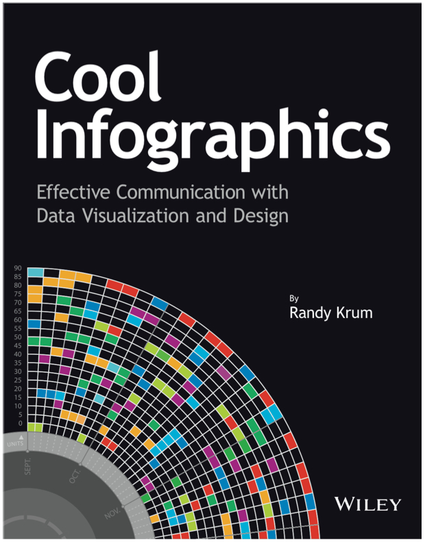
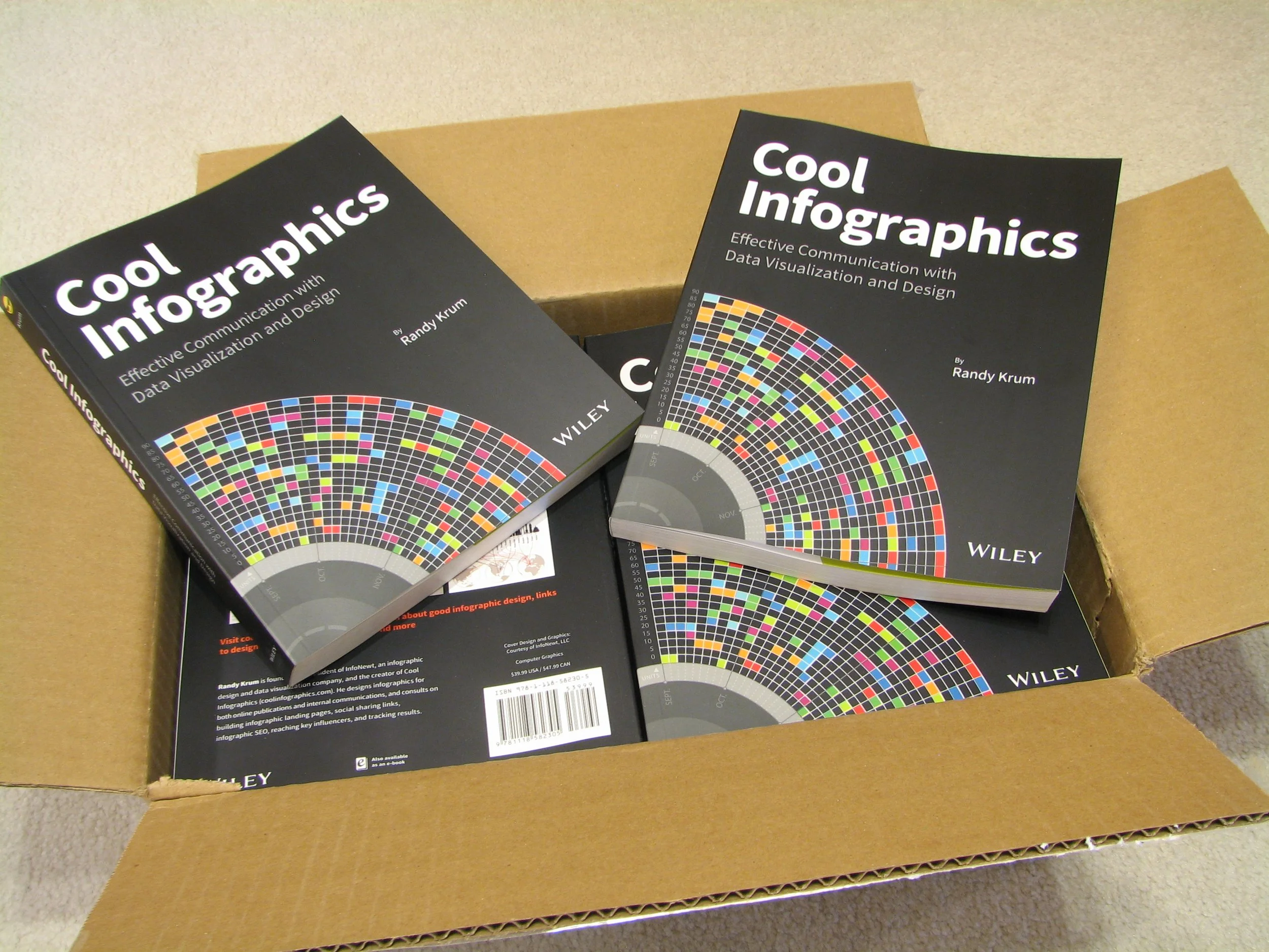
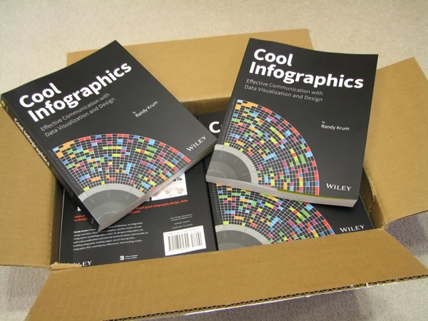
Ten years ago today, the Cool Infographics book was released on October 28, 2013. I frequently lament that it’s nice to have written a book, but the actual process of writing a book was pretty difficult.
I never set out to write a book. Wiley publishing approached me in 2011, and convinced me to turn the talk I was presenting at conferences into the outline for a new book. I had started my infographics design company, InfoNewt, in 2010, and was giving almost monthly presentations about my process to design, publish and promote infographics. Turns out that the talk outline did lend itself nicely to the structure of what became the Cool Infographics chapters.
Looking back, there were a number of unique challenges that I had to solve while putting together the book, and some were also new issues for Wiley.
Permissions to include infographics
I didn’t design most of the infographics I included in the book, because this wasn’t a book of self promotion. My goal was to share the best designs from the world of infographics as examples, and that meant including designs from some of the best designers in the world.
Here was my challenge. Most infographics are meant to be shared and reposted as much as possible online. “Going viral” was the ultimate achievement of an infographic. However, legally reprinting an infographic in a book required the explicit, signed permission of each infographic’s copyright holder. I ended up including over 100 infographic examples in the book, which was a lot of negotiation and legwork.
For every design I included, I had to track down the designer or publishing company, and get them to sign an official permission form that allowed me to include their design. I wasn’t able to include many of the designs I wanted to share because either I couldn’t track down the original designer, or they refused to sign the permission form.
Infographics are large
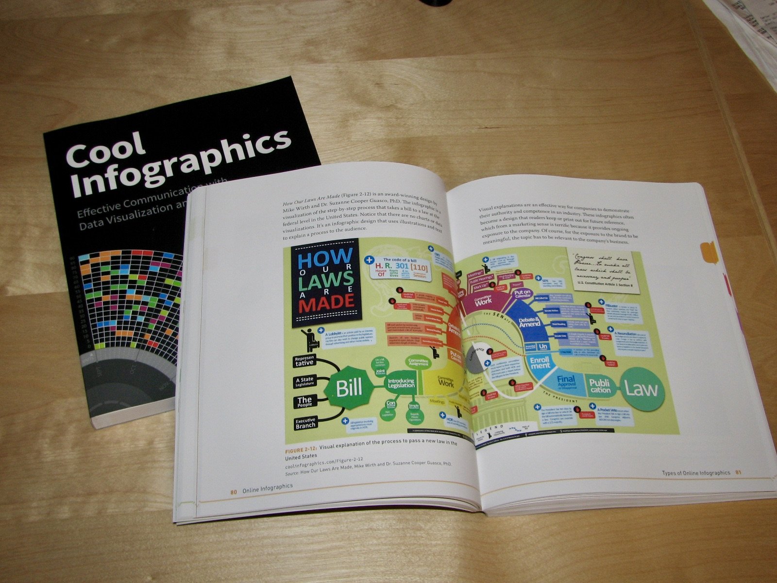
The online infographics that I was writing about were much larger that what could effectively be shown on the 7.3 x 9.2 inch pages of the book. They had to be reduced to fit on the pages, which made the text in many of them unreadable when sized to the book’s pages. Wiley didn’t want to publish a larger format book, so I had to come up with another idea.
My solution was that every design I included, also included a link to view the original infographic online. The downside was that readers can’t click a link in a printed book. That meant they would have to manually type in the URL, and many of the links were really long and complicated addresses. So, I created over 100 shortened links for the book, using my hosting platform from the coolinfographics.com website.
For example:
Link in the book: Coolinfographics.com/Figure-5-19
Forwards to the long original URL: http://create.mcgraw-hill.com/wordpress-mu/connectblog/files/2012/03/McGraw-Hill-Connect-Handout-WHITE-Small.jpg
See what I mean? No one was ever going to try to type in that long URL.
I also created an index web page for all of the Figures that had clickable links for every design in the book that is available to see online: coolinfographics.com/figures
Making the book navigation visual
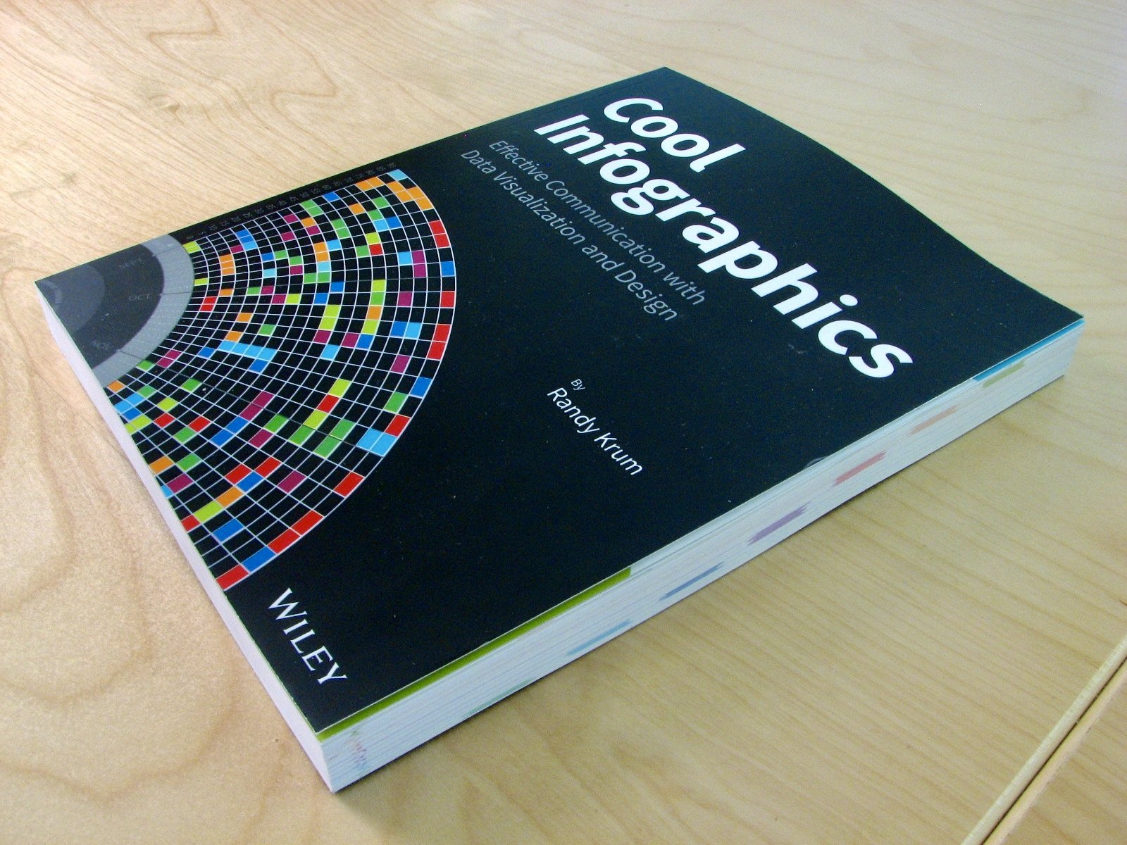
Infographics is a very visual topic. Not only do readers want to see the visual examples of every concept I discuss in the book, but I wanted the book itself to be visual too. This took some negotiating with Wiley to make happen. Every chapter has its own color, and I included that color on every page in a small tab that prints all the way to what is called the “fore edge” of the page. This makes the color visible at the edges of the pages even when the book is closed. These tabs are staggered down the page to provide an easy navigation to find the color you see in the Table of Contents.
Marketing was my job
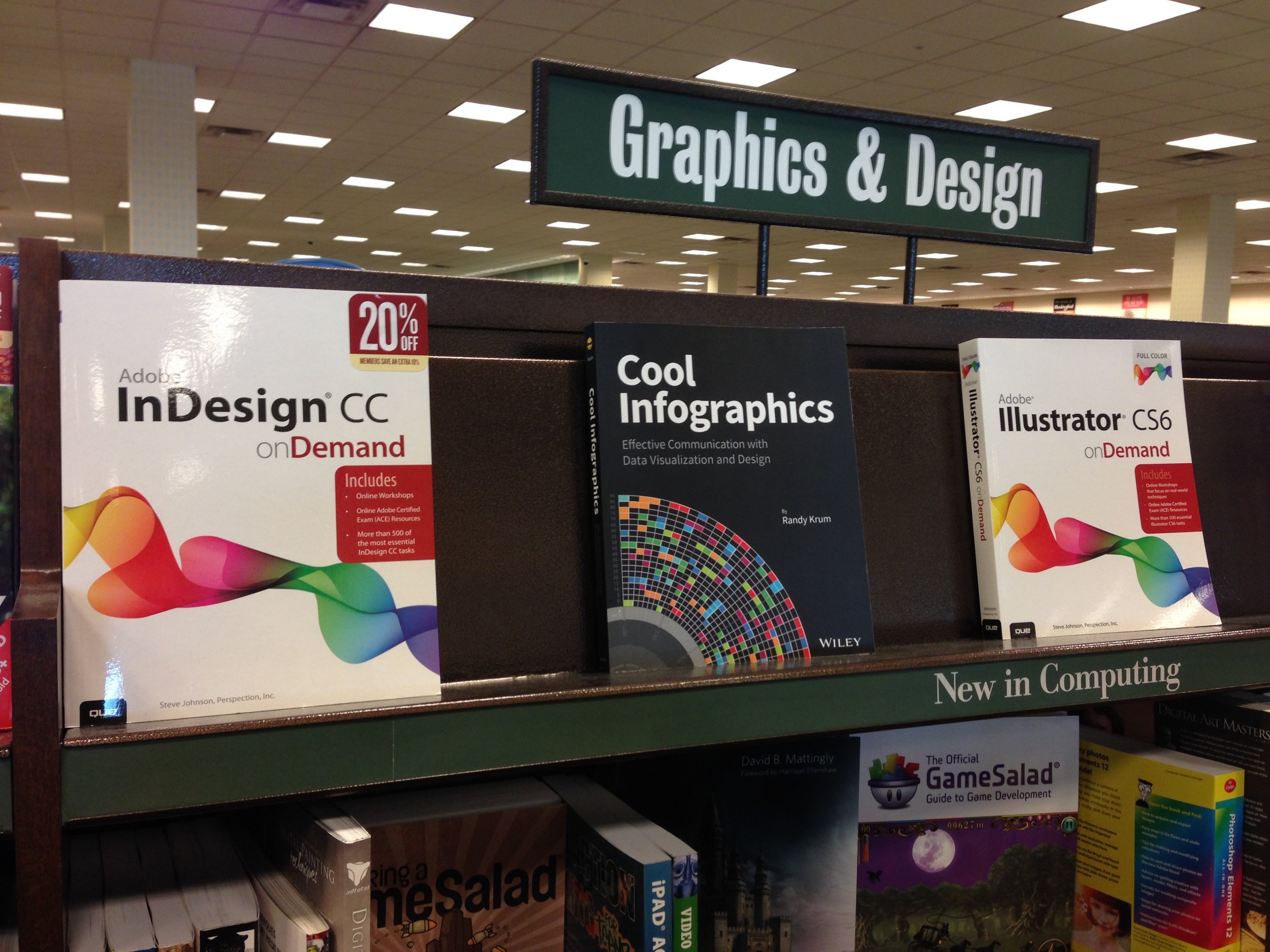
It turns out that most book publishing companies are very focused on publishing, printing and distributing a book, but not so much on marketing them once they get printed. Once a book is published they move on to publishing the next book, and the majority of promoting my book fell to me. This was something I didn’t expect. I am constantly teaching people that designing and publishing an infographic isn’t enough, and you have to promote it too. I wrote a whole chapter about in the Cool Infographics book! Similarly, I expected a big book publisher to be good at the promotion process for books. I was wrong. They printed a beautiful color book and got it into Amazon and onto the shelves at bookstores like Barnes & Noble, but that’s where their effort mostly ended.
Most of the promotion for the book has come from me. Whether it was one of my talks, a guest appearance on a podcast, an article that mentioned the book (like this one) or someone using Google to search for infographics and finding the Cool Infographics website.
Where to go from here?
The book has done really well for 10 years, and sales continue. The concepts I wrote about in the book are all just as relevant now, as they were 10 years ago. However, some of the example designs are out-of-date, and some of the design tools aren’t around anymore.
Where do you think we should from here? As readers of the Cool Infographics website and book, what would you like to see as ongoing content exploring the design, publishing and promotion of infographics? Videos, workshops, articles, tutorials, online courses, etc. Post a question, comment, or idea and let me know how Cool Infographics can be relevant to you in the future.
I’d love to hear from you. Either post a comment below or send me a note through the CONTACT page.
