The Spectrum of User Experience Design
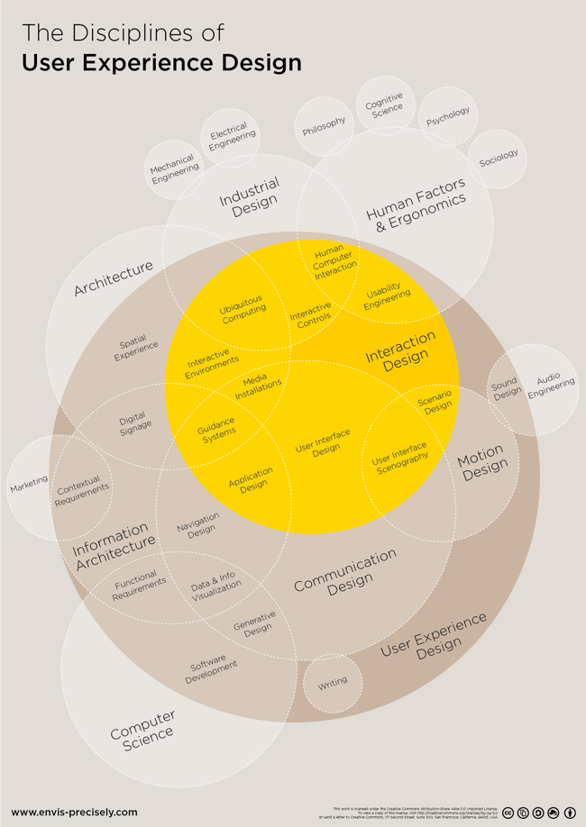
The Spectrum of User Experience Venn Diagram came up again recently in a discussion with a client, and looking back I realized I had never posted it here on Cool Infographics. Designed in 2009 by Oliver Reichenstein at iA (Information Architects), this is one of those everlasting designs that is even more relevant and popular today than when it was designed.
Oliver posted about it's origins here
Can’t we just all get along? Or leave each other alone? We can’t. The product, the interface and the communication build on the tension between the economic, the technological and the design force.
The business department and the engineers need to agree on a product definition that guarantees high performance; engineers and designers need to work together to make the interface as simple as possible; and designers need to team up with the business folks to get the communication consistent.
Six years later and I still love it!


