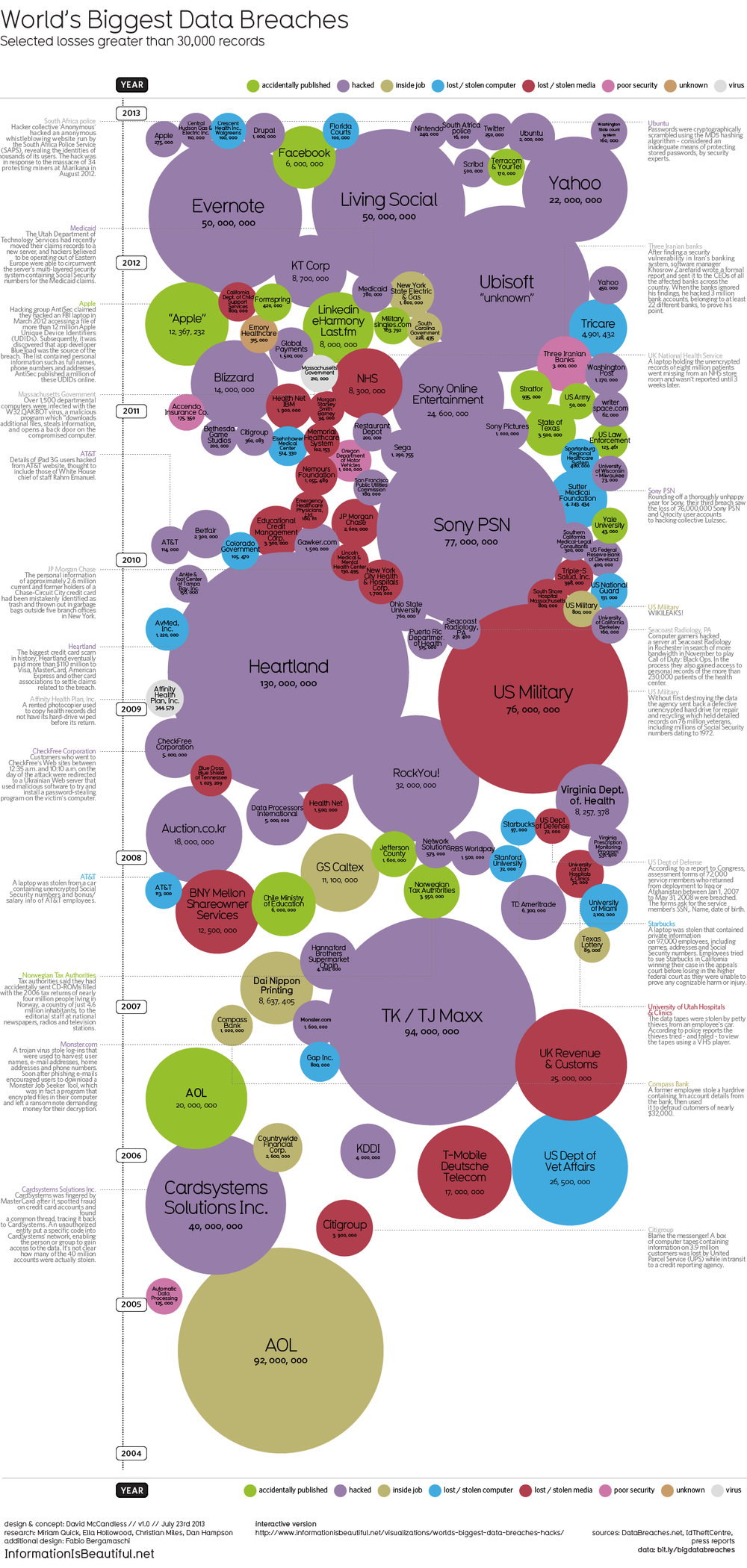
World's Biggest Data Breaches VisualizationWorld's Biggest Data Breaches Visualization
David McCandless and the team from Information Is Beautiful recently released both static (seen above) and interactive versions of the new World’s Biggest Data Breaches visualization.
This weekend, Apple’s developer site was hacked. 275,000 logins, passwords and other records potentially compromised. Two days before that, popular open-source operating system Ubuntu had its forums hacked. 1.82 million records stolen.
Are those big data breaches? Or just pin-points in the big data universe?
We’ve pulled out the interesting and funny stories out of the data. Click on the bubbles to read.
A fantastic design, the interactive version allows you to adjust the sorting, circle size and color-coding parameters. It’s very easy for the reader to understand how one data breach fits into the overall history of stolen data.
In a move for transparency, the entire data set gathered and used in the design is available publicly to anyone through a Google Docs Spreadsheet. Anyone can access the source data to verify the visualization or to create their own.
Found on Fast Company


