The Blog Tree: New Growth infographic and Q&A
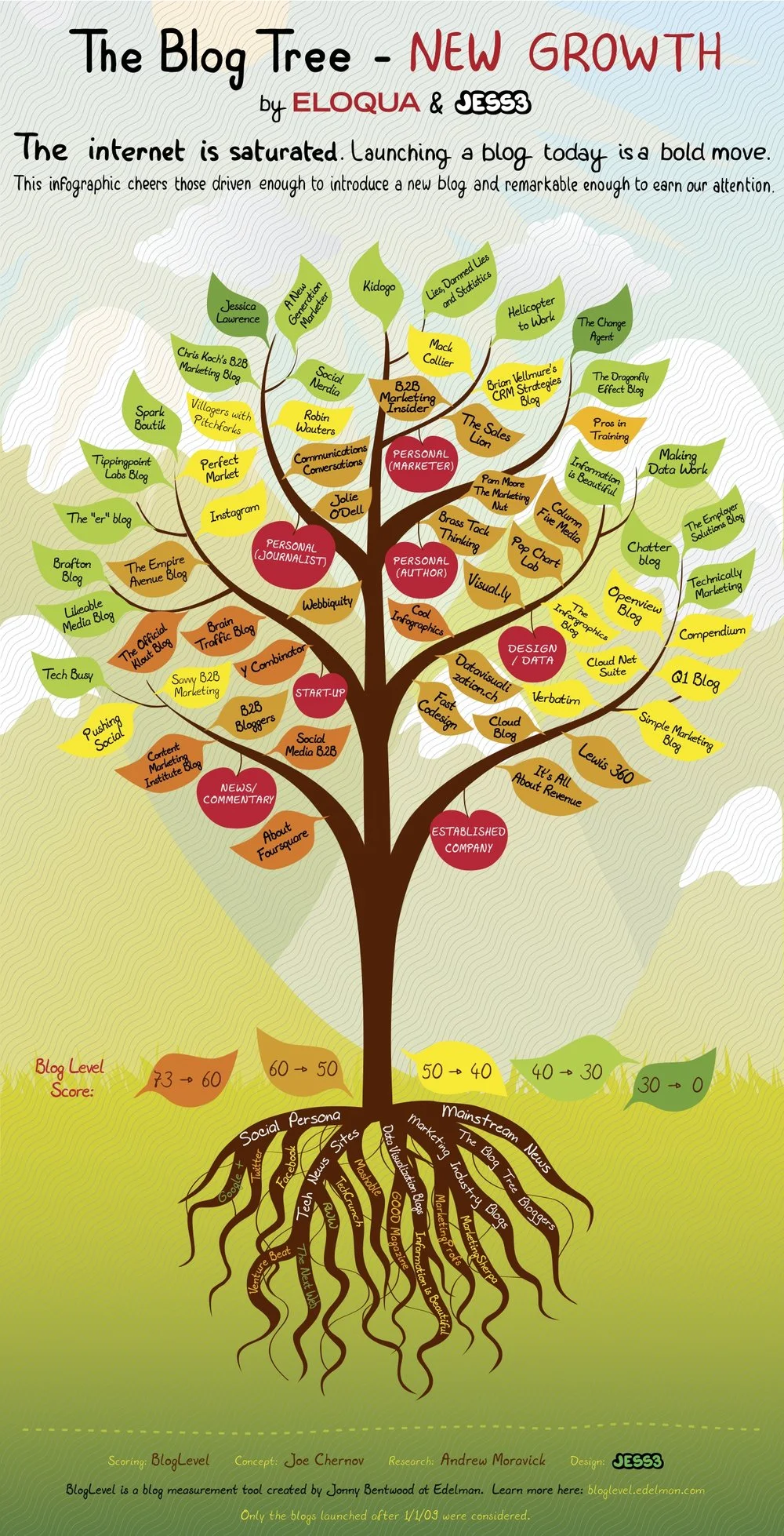
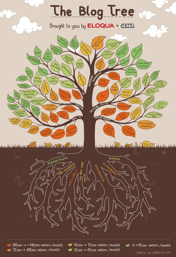
Eloqua and JESS3 have partnered again to design The Blog Tree: New Growth (building on the success of the original Blog Tree infographic project from last year). The new version focuses on new blogs from the last few years (INCLUDING Cool Infographics!) and uses the Edelman BlogLevel as the scoring system (a ranking system I hadn’t heard of before). They are also using SlideShare.net as an embedded PDF viewer so you can interact with the clickable version that takes you to any of the blogs by clicking on any particular leaf.
View more documents from
A couple things worth mentioning about the project:
The clickable version is available on SlideShare.net or as a downloadable PDF file.
They are using Facebook photos in a unique way. They are asking anyone interested in being a part of the next version to “Like” the Eloqua page and tag themselves in the image of this year’s Blog Tree.
They’ve added the concept of site badges this year for anyone listed on the tree. From a content stance, this is a great way to encourage long-term links from influencial blogs.
From the Eloqua blog post:
We’re calling today’s visual is The Blog Tree: New Growth editionbecause it celebrates a very important group of bloggers. New ones. All gene pools benefit from healthy DNA, and if the blogosphere is going to continue to evolve, it’s important that new voices are heard. The Blog Tree: New Growth cheers about 60 active, insightful blogs launched (or significantly re-engineered) after January 1, 2009. It’s truly a collection of the freshest voices on the Web.
After combing through the feedback we received on the original Blog Tree, we made two significant changes in this version:
Interactivity: Today’s infographic is interactive. Every leaf links to the corresponding blog. Interactivity was a popular request in the wake of last year’s visual, and when we shared a draft with the bloggers featured on the New Growth version, they too asked for it. The result is an infographic that fulfills its promise of making it easier for you to discover blogs we think you’ll love.(Much) Better Ranking System: Last year’s version looked only at Web traffic, and we received a bit of pushback on that ranking model. So we turned to one of the world’s most reliable sources of trust and influence: Edelman. We used Edelman’s BlogLevel tool as our sole data supplier because it gave us the most holistic view of each blog’s relative influence, popularity, engagement and trustworthiness.
I asked Joe Chernov, VP of Content Marketing at Eloqua, a few questions about the project:
Cool Infographics: You’ve partnered with JESS3 on a number of infographic projects now. What do you see as the biggest benefit of designing infographics as online content?
Joe Chernov: Marketing today is all about having strong “fast twitch” muscles. It’s about creating content, lots and in rapid succession, that appeals to viewers with short attention spans. It’s a hell of a challenge, especially for a business-to-business technology company, like Eloqua, whose story typically takes a little longer to tell. The benefit of an infographic is that it’s like a Trojan Horse: The visual captures attention, giving the marketer time to convey a message.
Cool Infographics: What did you learn from the original Blog Tree that changed how this one was designed?
Joe Chernov: We learned what worked. It’s funny, in “post-mortem” meetings, companies often focus on what didn’t work. But it’s also important to inspect what did work. When we released the original Blog Tree, I hesitated. I thought people might accuse it of being too high concept or pandering. Neither accusation was made. My hope was that the public recognized that we put thought into the selection, that it was truly a meritocracy. So what we learned going into the New Growth edition is that the key to success was found in the quality of the curation. Sure there were some improvements that needed to be made at the margins. Using traffic as the sole metric was a ridiculous oversimplification — and one that was 100% my fault — and, as you pointed out insightfully, the leaves absolutely should link through to more content, preferably the blogs themselves. So we made those changes.
Cool Infographics: What would you tell companies considering infographics as part of their marketing strategy?
Joe Chernov: Respect the medium. Simply calling a bunch of Excel line graphs and bar charts an infographic doesn’t make it one. Stuff like this (http://blog.marketo.com/blog/2011/09/attention-b2b-marketers-embrace-the-mobile-web.html), I believe, damages the medium because it eliminates art and nuance, which are essential elements of a good infographic. Before we publish any infographic I ask myself, “What would David McCandless (http://www.davidmccandless.com/) say if he saw this? Would I be proud to show it to him?” Try to be an ambassador for the medium, because it’s under duress.
Cool Infographics: I had never heard of the Edelman BlogLevel before. Why did you use that as your blog metric in the design?
Joe Chernov: We needed a better metric than the simple traffic data that we used to grade blogs in the original Blog Tree. Not only was that metric one-dimensional, it was also a poor measure of the quality of a new blog, which we were trying to highlight in the New Growth version we just released. After all, it takes a while to build up traffic to a blog. So we looked for a multidimensional blog “grader” from a trusted, independent source. Edelman and trust are synonymous, at least in the communications world. And their BlogLevel tool evaluates much more than traffic. It looks at engagement and the soft science of trust. I have also collaborated with David Armano, one of Edelman Digital’s leaders, in the past so I welcomed the chance to partner with him again.
Cool Infographics: In your opinion, why do blogs continue to be relevant online?
Joe Chernov: Because this is the era of transparency. Buyers want to know, really know, who they are doing business with. The blog, or at least should be, a window into the organization.
Also, check out Joe’s presentation about infographics that he gave at this year’s Content Marketing World conference, and available on SlideShare:
View more presentations from


