Where Americans are Moving (interactive infographic)
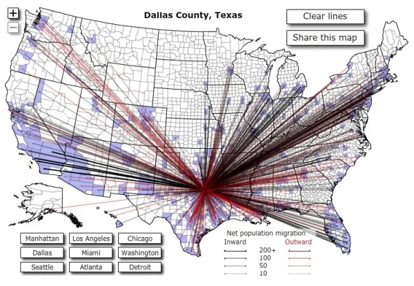
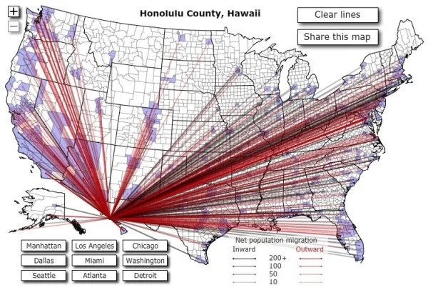
From Jon Bruner at Forbes.com, Where Americans are Moving is an interactive map infographic that shows the migration both into and out of that county. You’re not limited to the predefined cities that have buttons, but can choose any county in the country. Even after zooming in, it can be hard to see the details because there are so many lines displayed.
More than 10 million Americans moved from one county to another during 2008. The map below visualizes those moves. Click on any county to see comings and goings: black lines indicate net inward movement, red lines net outward movement.
Based on IRS data, I wish the statistics were easier to see. You can get access to the underlying data at data.gov; search for ‘migration’.
Who knew so many people were moving out of Hawaii?!?
Found on ChartPorn.com, FlowingData.com, and @JonBruner


